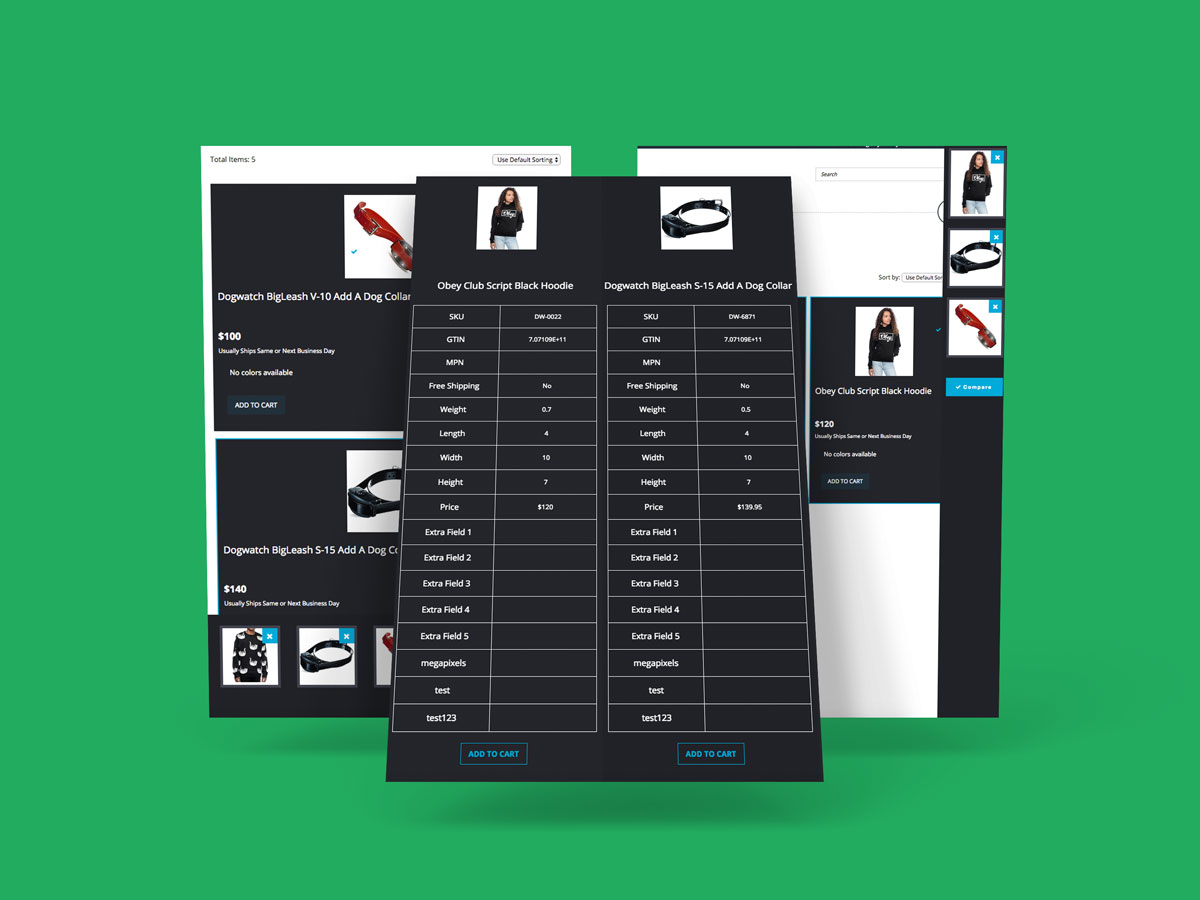
This was a re-design for an unsuccessful version of the web app and in the wrong way. Before, the app was selecting the products to compare showing multiple times an alert-modal, where allowed to comparing the item and then showing the result on a different page, wich was really un-user friendly and not focused on the performance and speed of the app.
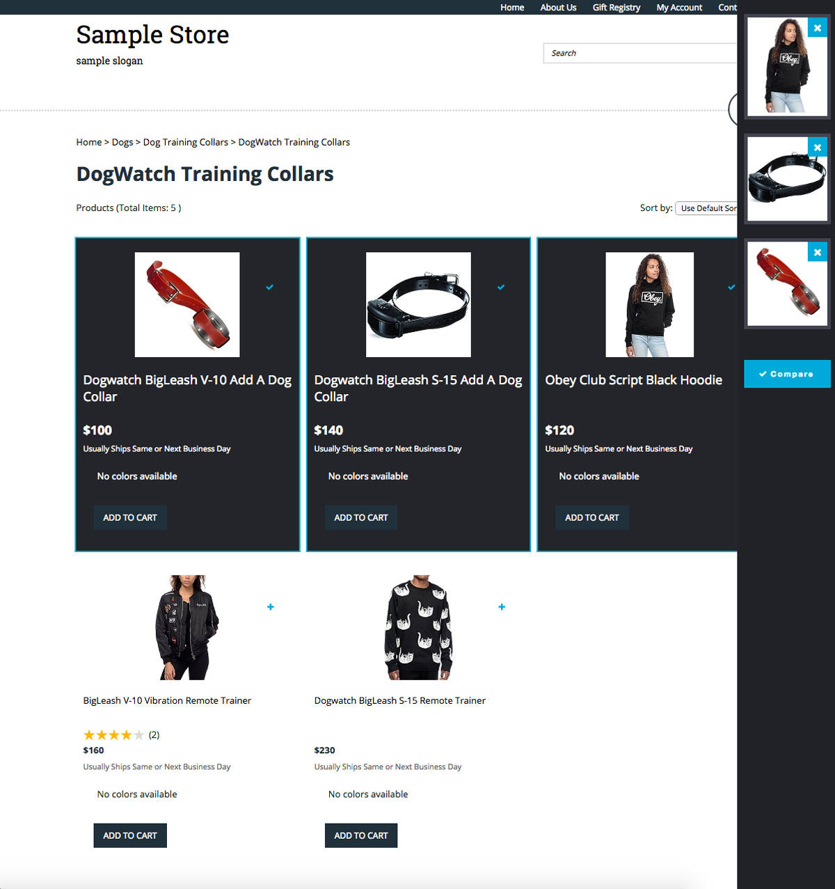
Now the app has the UI/UX on a higher level than before, using local storage, Ajax, jQuery, animations with CSS3 and a clean markup with HTML5, the web app is fully responsive and easy to use, and works to compare thru multiple categories.
It was a big challenge for me because was to create a GUI product comparison plugin, focused in the UX and bringing the right UI to mix different techniques to enrich the code, design concept and performance of this app.
The app will be a paid in the 3dcart app store, and that allows merchants to select a variety of comparison points that their customers can use to compare products, such as size, price, and more. Up to 4 products can be compared simultaneously.
Project
Product Comparison
Client
3dcart Shopping Cart.
What I Did
UI/UX Development implementing my own version of the design concept
jQuery
I used that for manipulating the DOM, create prototyping and templating for the app.
Ajax
Brings results from a different page, and populate the final compare products.
Local Storage
Helps to take each product in the basket and hold it there, to then show it in multiple categories.
Animations
Use smooth keyframes to make the app more interesting and with a High-level UX.
Add to Sidebar
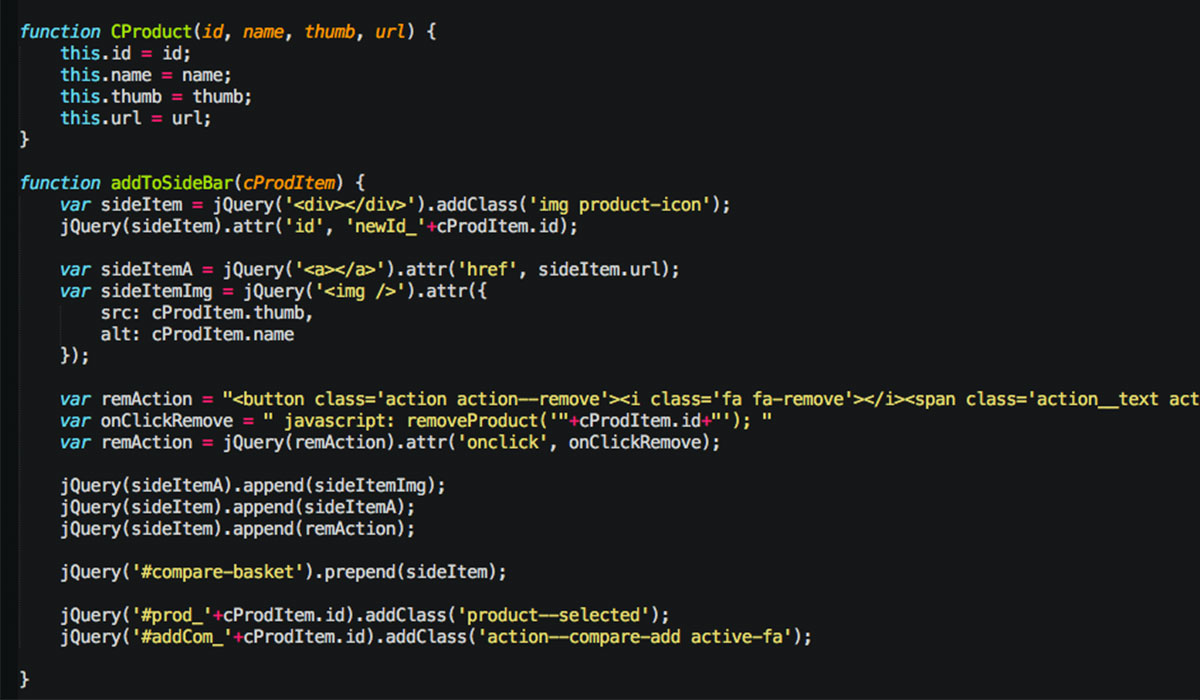
First, creates the object which contains all the elements needed to show the UI in the sidebar “basket”.
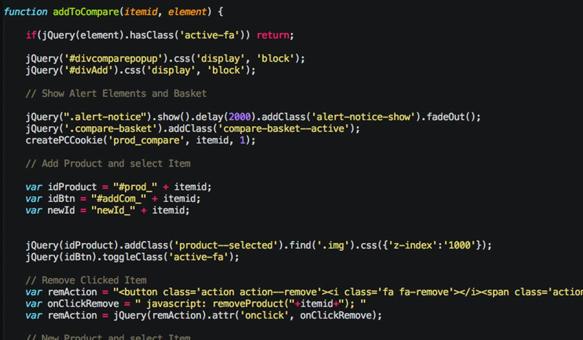
Add to Compare
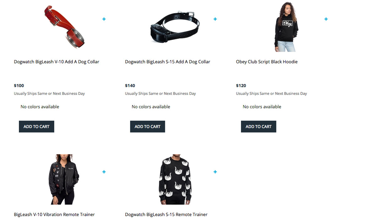
Here is where everything starts, is all the interaction with the DOM to show different components in the UI and takes the ID item for each product.
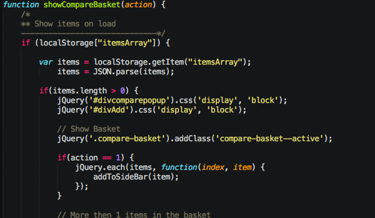
Show Basket
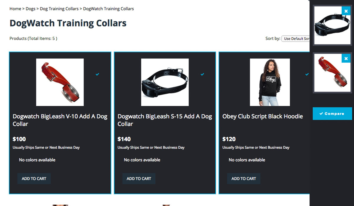
Bring each element and sets a local storage for the compare session. Interacts with the DOM and activates the logic to show at least one in the sidebar and allows you to compare only when is more than 2 products.
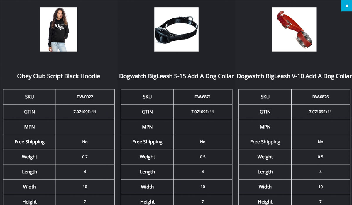
Stage 1
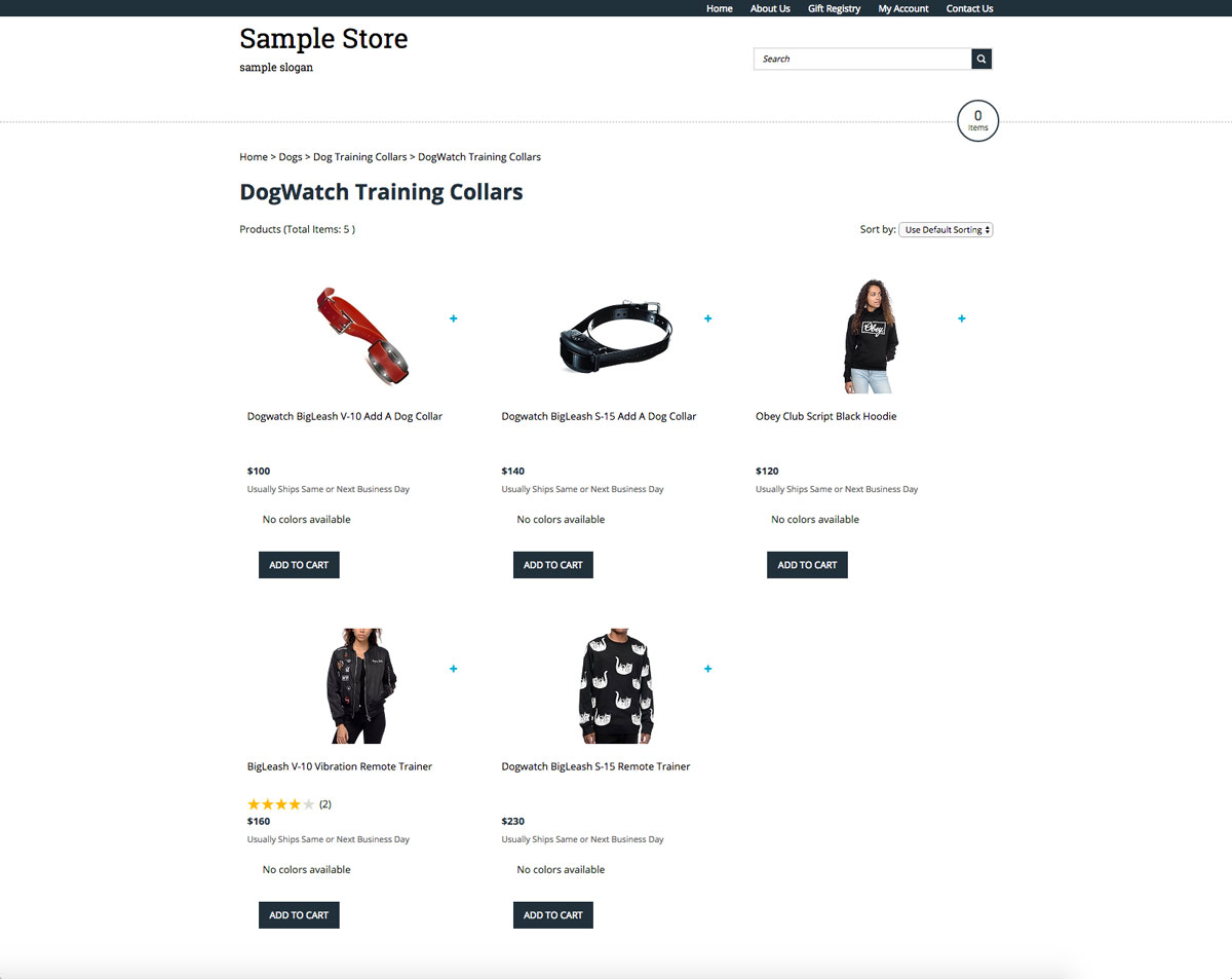
Stage 2
Stage 3

Before
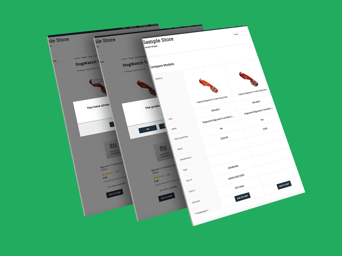
The Result
